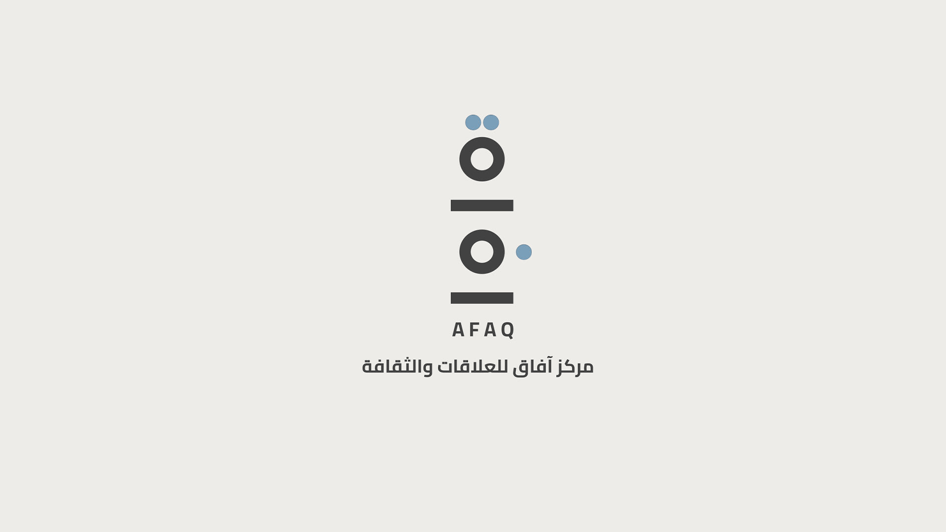
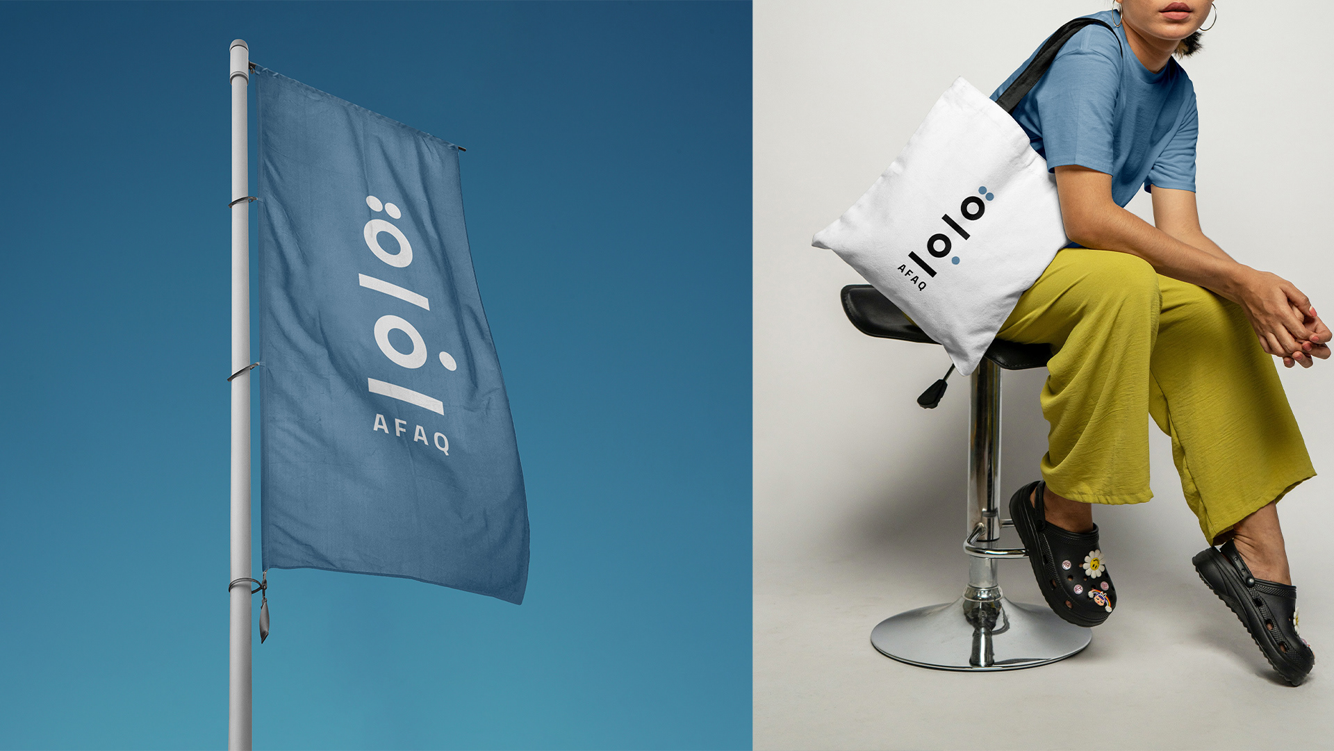
Afaq — A Cultural Bridge Between Qatar and Turkey
A Line That Begins the Story
Every design begins with a line. Sometimes it's a sketch on paper, sometimes a whisper of an idea, sometimes a path waiting to be walked. Afaq began as such a line - one that stretched far beyond the page, carrying with it the weight of history, culture, and vision.
This was never just about making a logo. It was about building a bridge. A bridge between Qatar and Turkey, two nations bound by shared traditions, language, and values, yet each with its own distinct identity. The challenge was not to choose one or the other, but to create a visual language that honors both - and in doing so, to design something that feels timeless, authentic, and alive.
The Horizon — A Pathway Between Nation
The word Afaq translates to "horizons." In the logo's sweeping curves, we see more than a line; we see a bridge. One end rests in Qatar, with its rising modern architecture standing tall against the desert sky, while the other stretches toward Turkey, with its rich cultural heritage and layered history. Together, these horizons tell a story of possibility - of two nations rising as stars in the global cultural and design landscape.
The horizon isn't just distance. It's direction. It's a reminder that both countries, while proud of their roots, are always reaching outward, forward, toward shared futures. The logo's curves capture that momentum - the motion of cultures walking toward one another across a bridge of creativity.
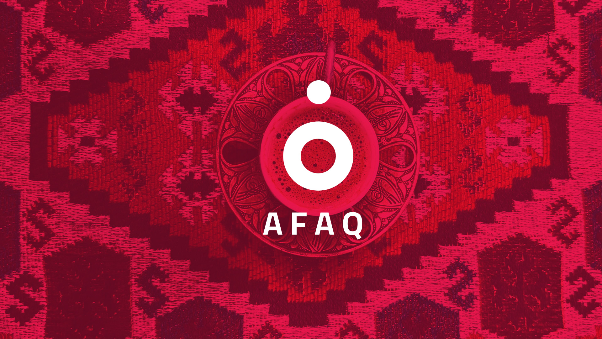
The Coffee - A Gesture of Welcome
In Qatar, when you are offered a small, steaming cup of Arabic coffee, it's not merely a drink - it's a declaration. It means you are welcome, you are honored, you are part of us. In Turkey, too, the ritual of Turkish coffee is steeped in hospitality, conversation, and care. Across both cultures, coffee is a language of generosity.
The Afaq logo carries this circle of warmth. Its forms echo the curves of a coffee cup, intimate yet universal, drawing people together. Just as coffee opens doors and begins dialogue, the logo symbolizes cultural hospitality - a bridge built not of stone or steel, but of shared rituals, small gestures that carry enormous meaning.
The Sea - Waves That Carry Culture
Between Qatar and Turkey lies water - the Arabian Gulf, the Mediterranean, the seas and channels that for centuries have carried merchants, poets, scholars, and travelers from shore to shore. The undulating rhythm of the Afaq logo mirrors the sea, fluid and ever-moving.
It is through these waves that ideas travel. Language, trade, cuisine, music - all have crossed these waters, flowing freely, just as culture should. The sea becomes a natural bridge, one that does not divide, but connects. The logo pays homage to this fluidity, suggesting that cultural exchange, like the tides, is unstoppable, endless, and essential.
Tourism & Gatherings - Where Horizons Meet People
What began as a single point in the original sketch transforms, in meaning, into something larger: gatherings. Qatar and Turkey are not just connected politically or historically; they are cultural destinations that draw the world in.
Tourists flock to Qatar's souqs, museums, and skyline, where tradition meets the future. In Turkey, they wander through ancient bazaars, Ottoman palaces, and vibrant coastal cities. Each visitor becomes part of the story - carrying impressions, conversations, and experiences back to their own countries.
The gatherings themselves become living bridges, proof that connection is not just an abstract idea but a lived reality. In this way, Afaq doesn't only symbolize exchange between two nations; it embodies the flow of people, stories, and encounters that expand horizons everywhere.
Tradition Meets Modernity
To design Afaq was to honor the past while shaping the future. Arabic calligraphy, the root of the logo, grounds it in authenticity and heritage. Each curve is intentional, each letter handmade, reminding us that culture lives not in pixels but in craft.
Yet the form is not trapped in history. The elegance of the calligraphy is balanced by a modern aesthetic - clean, open, and timeless. The design nods to global visual language while staying proudly rooted in Arabic tradition. It's a mark that can live on a cultural center's facade, but also stand confidently in digital spaces, exhibitions, or international collaborations.
A Personal Journey
As a designer, my role was never just to "create a logo." It was to listen. To listen to the histories, the rituals, the symbols that define Qatar and Turkey. To understand not only what connects them, but how those connections feel.
The line began as a sketch, but it became more - a conversation. Between me and the cultures I was drawing from. Between heritage and modernity. Between what is seen and what is felt. Afaq was not designed in isolation; it was shaped by stories, gestures, and the invisible threads that tie nations together.
A Cultural Conversation
Logos can sometimes feel like stamps - static, unchanging. But the Afaq logo is alive because it carries dialogue within it. It speaks of horizons and bridges, but it also leaves space for interpretation, for viewers to find their own meaning.
To a Qatari, it may recall the long stretch of desert horizon, the ritual of Arabic coffee, the pride of tradition. To a Turkish viewer, it may echo the curves of Ottoman calligraphy, the waves of the Bosphorus, or the aroma of Turkish coffee shared with a friend. To the world, it becomes a mark of connection, proof that identity and openness can coexist.
Beyond the Mark
Afaq is not only a logo or a cultural center; it is a reminder of what design can do. Design can build bridges, create dialogue, and tell stories that words alone cannot capture. The logo is a visual language - one that does not need translation because its essence is universal: connection.
In an era where design is often reduced to trends or quick fixes, Afaq stands as something deeper - a cultural artifact in its own right. A symbol that carries hospitality, heritage, and horizons into every space it touches.
Closing the Horizon
At the heart of Afaq is a belief: that culture is not a wall but a horizon, always inviting us to walk further, to see what lies beyond. Qatar and Turkey share this vision - rooted in pride, yet open to the world.
The logo is just the beginning of that journey. A single line that becomes a bridge, a bridge that carries stories, and stories that carry us into the future.
Afaq is not just a cultural center. It is an invitation - to connect, to share, and to imagine horizons without end.
Let’s Collaborate
If you're looking for a custom Arabic logo that captures cultural richness and professionalism, let’s create something meaningful together.
Contact me → Here